Pearl Pathways is a comprehensive life science product development services company with an interesting channel. Along with their core business supporting biopharmaceutical, medical device and diagnostic companies they have a second business unit. This unit, called Pearl IRB, provides an independent institutional review of all aspects of human research.
They wanted us to create two sibling websites which communicated a close relationship, but also had their own distinctive look.
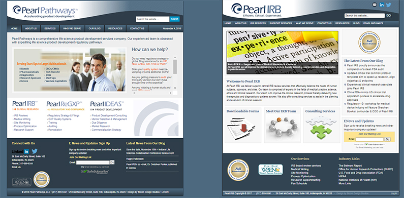
This is where the web redesign project started:

Both sites were built using the same WordPress theme that we recognized immediately because years ago we had used it as the foundation of the Roundpeg site. Popular in its day, the theme was not mobile responsive and gave both sites a very boxy look. Unless you carefully read the masthead, you weren’t actually sure which site was which.
Creating a unique online identity for Pearl Pathways
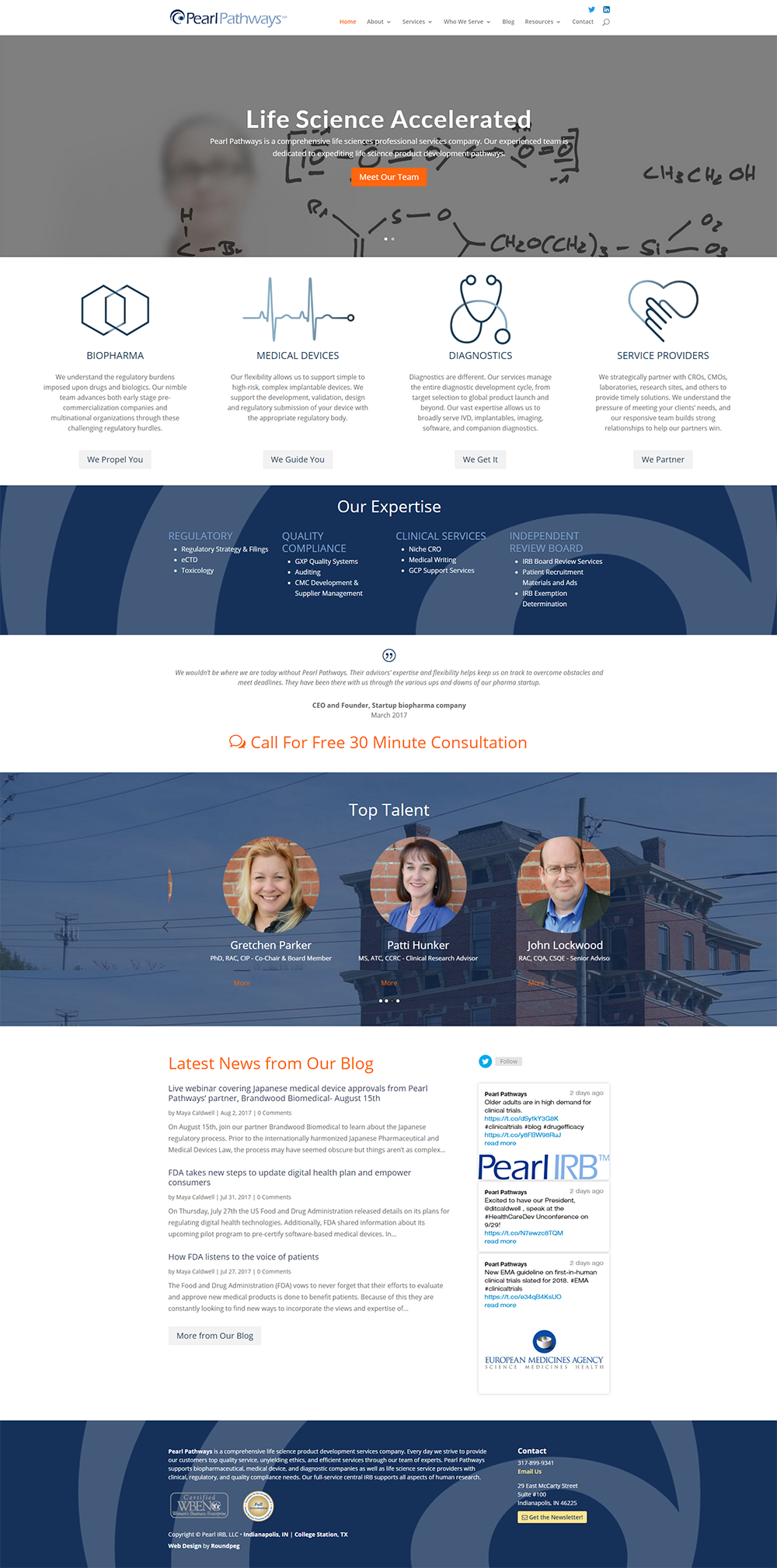
While we knew we were going to redesign both websites, we decided to treat them as two independent projects. That allowed us to dive into the purpose for each site, creating a unique online identity for each. Starting with Pearl Pathways, the parent company, we were inspired by the visual style of chemical formulas and medical devices. These images gave us a starting point for the other icons.
![]()
As a technical company, there was a significant amount of relevant content that needed to be on the home page. We used the icons and color blocks to break up the home page, making it easier for visitors to skim for the information they were seeking. The oversized logo element behind the blue section is repeated throughout the site to firmly establish the branding.

A Different Focus for Pearl IRB
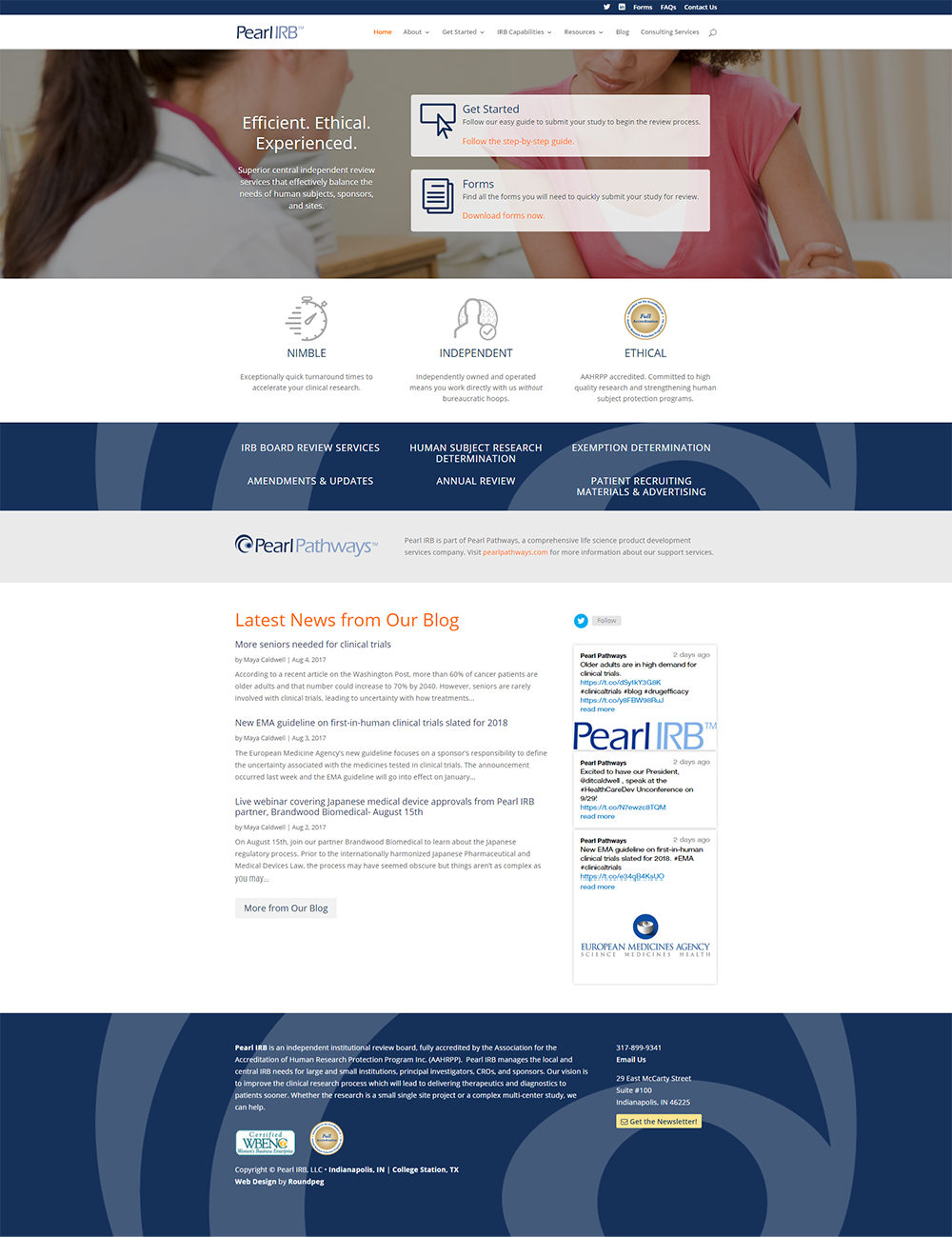
While the Pearl Pathways website is very broad and includes a range of services, the Pearl IRB site is dedicated to their Independent Review Board services. We worked with Pearl Pathways to identify their highest priority actions. They wanted to create the quickest path from the homepage to beginning a review. Two prominent call-to-action elements in the first row focus on getting customers exactly what they need in the fewest number of clicks.
The audience for this site is likely to return again and again, so making the forms accessible expedites each transaction. The icons for this site are more direct and less stylized. They contribute to a polished look and feel without distracting from higher priority calls-to-action.

The Pearl IRB site also features the same oversized logo element on a blue background. This element creates visual unity between the two sites.
Ready to start working on your online identity?
What’s it like to work with Roundpeg? Waylon and Diana share of Pearl IIRB share some thoughts.
