I haven’t been to Red Robin in a while, but they used to have a pretty clever way of talking to curious people waiting for their burger. If you picked up whatever freestanding cardboard piece was at the center of the table and flipped it over, they had a quip like “Nothing to see here. You can put me back down now.” It was such a pleasant surprise and spoke to the cheeky, easygoing tone Red Robin uses in all its branding efforts.
Not every restaurant can be so flippant in their copy, but they still need to help discerning guests decide what to order from the menu. The menu design will determine not only what they order, but how the diner will feel about what they’re getting in return for their money. Here are several tips on how to use menu design to put your guests in the right mood.
Talk with typography.
I’m going to suggest later not to use photos on your menu, which means your typography choices need to be strong. Typography makes and breaks design in general, and when there’s so much copy on a single piece of paper, coherent type decisions are essential.
The most important part is to make choices from the beginning and then stick with them. My advice is to pick at most two typefaces, which are the containers that hold fonts. For example, if you drag out the “Helvetica” container, it will hold a Helvetica bold font, italic, medium, regular, bold italic, and so on. Select one font for the header of a section, another font for a menu item, and another style for the description.
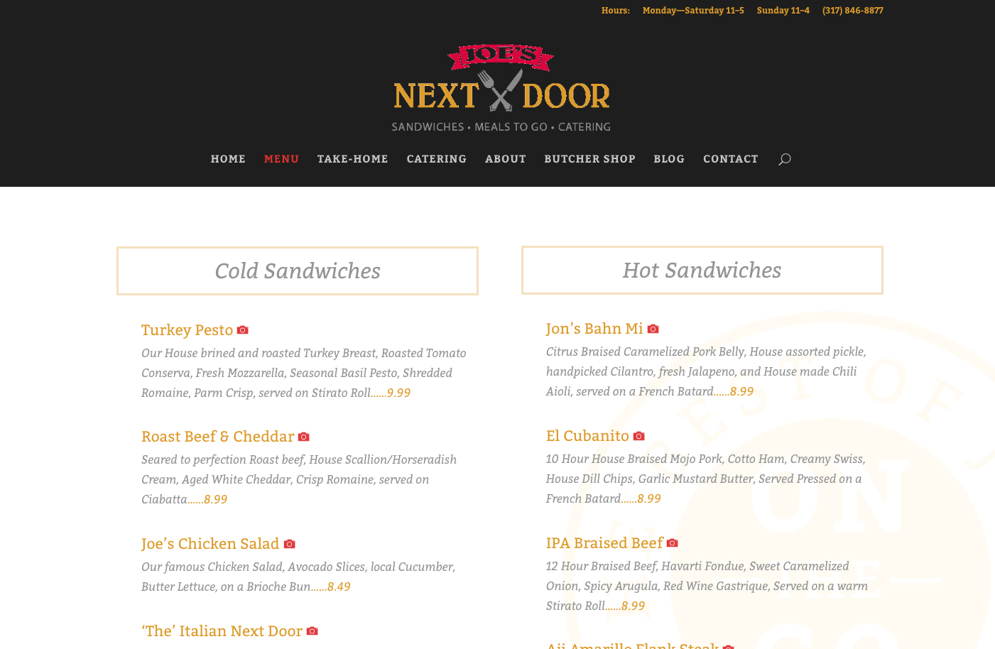
Let’s look at the menu design we created for Joe’s Next Door. To keep it simple Bitter was used for all of the typography. The section is marked out with a box and a larger italic, the menu item is regular Bitter in bright gold so you can easily hop from one item to the next without getting mired in the description, and then the description repeats the Bitter italic for both consistency and differentiation.

Legibility is also important. Considering the lighting in restaurants keeps getting darker, you don’t want your guests to have to hold up the menu to the candle on the table to be able to read it for many reasons. The best type size for readability is considered to be 11pts and I would recommend not going below 9pts. A good designer will also allow for plenty of leading (space) in between the lines which also helps with legibility.
Ditch the dollar signs.
If you’re like me, you tend to scope out which menu options have the lowest price tag just for reference. You’ll rarely see dollar signs on menus because it encourages just that–looking for the smallest number. Removing dollar signs makes the pricing less apparent and may even make customers more likely to spend more money. Some experts even advocate for using numbering systems can such as 10.5 instead of 10.50, but frankly, I think that’s just annoying.
It’s important for the guest to see all the menu items at once.
If you’ve never been to the Cheesecake Factory, then not only are you missing out on an abundance of excellent desserts but also an overwhelming menu, and I don’t mean that in a good way. By page three I’ve lost hope of keeping track of all the different entrée options, and there are still a few more pages to go.
A good rule of thumb is to keep your menu to a trifold or less and put your desserts on a separate menu. If a diner sees a desirable dessert, they’ll often forgo an appetizer.
Use photos wisely.
I know, that rib eye steak looks absolutely stunning on the plate. Save the professional photography for your website and marketing promotion to lure your customers in. Once they’re sitting down and looking at your menu, you don’t want them to associate your establishment with a Denny’s or another chain that uses a lot of photography on their menus. Fine dining establishments won’t have any pictures at all, so it depends on what tone you’re trying to set.
Really let them feel it.
There’s something special that happens between your fingers and your brain when you touch a menu, business card or book that’s printed well and on good paper. It’s not even necessarily conscious, but you know there’s a reason the romance novels at the grocery store are printed on cheap paper and have thin, super-glossy covers. The ideas inside aren’t exactly unique or, more relatedly, have enough value to bother putting them in something better.
Same with your menu. Consider what kind of impression you want your menu to have. If you’re a laid-back taco stand, writing out the menu and scanning it onto copy paper is fine because tacos aren’t that self-important. If your entrees go for a higher price-point and you hand a patron a stained piece of paper, they’ll be concerned how exactly you’re preparing their food in the back.
If you’re looking for inspiration, Art of the Menu never disappoints as a well-curated blog of excellent menus. As with any design project, the more thought and strategy you apply to your menu, the more it will resonate with your customers.
Looking for more information on design and marketing? Check out our weekly newsletter.
FREE Business Advice Delivered to Your Desktop.
