So you’ve left the corporate world with your carefully outlined executive processes and programs in countless binders. You’ve walked out the doors with these color-coded masterworks clutched tightly to your chest like precious, precious children. They’ve got the potential to generate income for years if you strike out on your own as an executive coach.
You know your first step in this new direction is to get an executive coaching web design. But where to start? You can follow some of my own tips to prepare for a new web design, for starters. But don’t stop there, look for good examples online. It’s always helpful to see what other people like you are already doing. Pick out things you like and things you don’t like.
To get you started, I’ve assembled a collection of 7 of my own favorite business coaching websites. Which is your favorite?
Brendan Crowley Advisors

I love the simplicity. Brendan’s on his own here, so there’s a great portrait of him on the homepage, four blurbs that correspond to his focus areas as well as blog posts and an email signup CTA.
Some executive coaching web designs go on for miles to persuade you in the moment. Brendan doesn’t have time for that BS. Either you pick one of those four blurbs to go deeper (where he does get more persuasive) or you filter yourself out.
E Carey and Associates Consulting

So fresh! Talk about dressing to impress. The bright blue branding reminds me of an engineer’s crisply pressed button-up. That, and blue-raspberry Slurpees. But that’s my personal problem.
While there’s no portrait of founder Elizabeth Carey on the homepage, the stock photo complements the main message of “building exceptional teams.” We’ll see another site later on that avoids featuring its founders on the homepage (indeed, it has zero photographs). But E Carey and Associates proves you can do an executive coaching web design without a splashy photo session.
Hazel Walker

But if you want to go all-in with a full set of personal portraits, make good use of them! Hazel Walker’s web design makes dramatic use of a simple, casual portrait to set the tone. You’ll get honest and straightforward direction: insightful stuff you can act on today.
I super-dig the over-sized typography, that big and playful globe illustration in the background as well as the rich-looking background image at the bottom of the website, make sure to visit and scroll down for that.
H. Freeman Associates

Henry here is not an executive coach per-se. He’s a fund development professional with tons of experience helping fundraisers do more for their organizations. With this focus, the homepage makes it clear he thinks the children (otherwise known as The Future) are what matter. It’s a message that should resonate with non-profit executives.
From there, the homepage introduces our main-man Henry as well as a nice email signup module and book promo. All of which builds credibility for Henry, especially the kudos from thought-leaders at the bottom.
Justin Patton

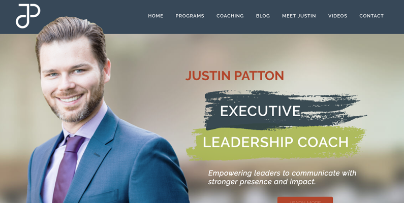
Hey good lookin’. There’s nothing wrong with using your face to sell yourself. Even if you’re not as sharply dressed as Mr. Patton. We’ve seen how Brendan and Hazel both use a portrait to set the tone for the web design and immediately communicate something about what it’s like to work with them.
I’m also a fan of the carefully planned sections on the homepage. Each section only has 1 row of items, letting the content spread out. It feels premium. Too many other executive coach web-designs stuff cheesy headlines and marketing-speak into tiny spaces, leaving me overwhelmed like I’ve stumbled into a crowded discount store. Justin’s site welcomes you like a well-mannered associate at JoS. A. Bank.
Unfortunately, there’s a very thin font used in very small sizes throughout the site making it a pain to actually read things. Fix this please!
Think Human

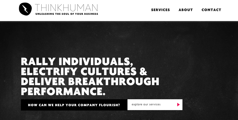
What if your business model includes working with a team of other people? A team that kinda rotates and not everyone on the roster plays all the time? How do you create an executive coaching web design when you can’t show any coaches?
You write some really great words and make them BIG. Think Human’s branding takes a monochromatic, no-frills approach that leans on slick copywriting and selective deployment of bright colors and illustrations to drive the point home.
Steve J. Thomas

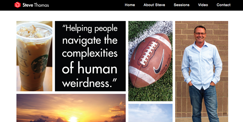
Gosh, I like this guy. While Think Human spilled a ton of ink to tell you their quirky story, Steve’s homepage pairs a few of his favorite things in pictures with a colorful, self-aware tagline. I can tell Steve likes Starbucks, football, sunsets, NYC, and dad jeans. He might have some jokes too. This all leads directly into a video where Steve demonstrates his presentation style and message in a video literally titled “What I Do.” What more could you ask?
There’s another video after that and more examples on the helpfully titled “Video” page. Be like Steve and just be you, whether you live life in jeans or sharkskin suits. Get videos of you presenting and speaking to show prospective clients your expertise, confidence and personal style.
Special Mention: Don’t Do It Like This
In searching for web designs to include in my list above, I came across a few pet-peeves. Don’t make these mistakes, please.
First, please don’t use any stock photos with this guy.

He’s modeled so often and in so many over-used stock photos that his presence immediately signals laziness on your part. Couldn’t you take your own pictures (like Justin Patton) or if you don’t want to appear on-screen, commit to typography-only design, like Think Human?
In searching for executive coaching web design examples across 5 cities in 3 states, I saw this guy pop up on different home pages no less than 4 times. A little overlap is ok, but I just think he’s played out. Plus, I still can’t decide if that’s actually Hollywood actor Eric Roberts or a younger looking robot facsimile. Definitely one of those two though.
My second no-no is including the Webster’s Dictionary definition of “executive coaching” as a prominent homepage call to action. Really? You are so much better than copy/pasting a dictionary definition.
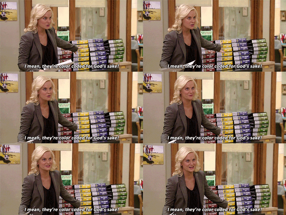
Like the consummate planner, hustler, and public servant, Leslie Knope, you’ve spent years improving things within your organization by making binders (so many binders) full of guidance.

Now it’s time to start your own journey with an executive coach web design. So, make it your own.
Find your way by making your wish-list, starting a mood-board, or any of the actives I recommend in “4 Fun Things to Do Before You Get a New Web Design.” And make sure to make your own notes about these executive coach web design examples and any others you find! Seeing what you others are doing is one of the best ways to see what you want to avoid and what strategies you want to try yourself.

