The intermission is almost over. Make sure you are stocked up on overpriced food and drinks, find your seats and get ready for the second half of the show.
We are back talking about web design, music venue web design to be exact. A good website and web design for a music venue is just as important as bringing in great acts. It is a place for people to learn more about the locale, learn more about the performers, see what is coming on the schedule and, of course, buy tickets.
Last week we looked at the websites for Indianapolis’ most popular music venue websites to determine whose creativity best spilled out from the stage to their website. When we left off, White River State Park held a slight edge. If you missed the post, you can go back and read Part 1.
But, do any of my remaining three have the right stuff needed to take the top spot? Let’s see.
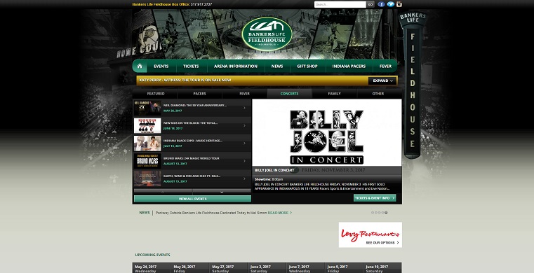
Bankers Life Fieldhouse
What I like: Bankers Life Fieldhouse is a multi-purpose arena. It is the home court for Pacer and Fever games and is used for concerts and family events as well as having the capability to host WWE events, hockey games and even monster truck rallies. Despite all that, the web designers do a good job of keeping the site current, updated and prioritized.
Ticket sales are the primary purpose of this website. Used primarily by the Paces and the Fever, it’s nice that concert goers don’t have to wade through advertisements or ticket sales for these events. Not only does it make the site easier to navigate, it avoids distractions and irritations by the visitor.
The website uses color choices that are on brand and work well with each other and the background. This is another site that doesn’t absolutely blow the background. They use some cool photos to show off everything the venue has to offer without getting too distracting.
Although Bankers Life typically books acts that are fairly well known, the web site also offers robust and in-depth write-ups on each act (just in case you live under a rock and don’t know who Billy Joel is). They also archive photos from past shows, which is another great tool for building excitement.
What I Don’t Like: Honestly, I can’t find a whole lot to gripe about with this website. Most of it is just nit-picky stuff like a lack of a seating chart. There are some awkward-looking ads and some outdated graphics for their social media which are a little distracting. But, overall, this was one of the more solid music venue web designs I ran into.
Lessons: Keep your site updated and current. If you offer multiple services, make it easy for visitors to find exactly what they want and not get bogged down with everything else.
Old National Centre
What I Like: Old National Centre is a unique venue that features multiple rooms within the building, ideal for different kinds of shows and functions. Their website does a nice job of giving exact information on each room and what makes them unique. Much like talking about the history of a venue, showcasing what makes you unique is always a good way to make yourself stick out.
Another brilliant thing this website does, that I would never have considered with other music venue sites, is offering FAQs. FAQs for a music venue may not sound so awesome initially, but when you think about the idea of people coming from out of town to see a show and stay the night, FAQs are a really great idea. “Where can we park?” “What are good restaurants nearby?” “Where is a good hotel nearby?” These are good questions to answer for visitors.
Visually (in some aspects, certainly not all) this site does well also. A slick background, images from past shows and connecting to artist’s Instagrams give some fun and interesting things to look at.
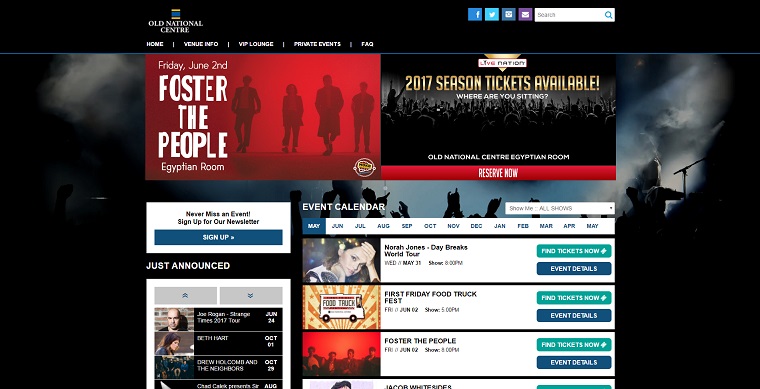
What I Don’t Like: Ironically, this web design’s biggest issue is visual. Three words: Holy Buttons, Batman!
In just this screenshot of the homepage, I count 9 buttons. That is way too many buttons and way too many calls-to-action. Trust me, there are lots more. This is one of the worst sins of a bad web design. Visitors have no idea where they should look or pay attention. All the font is the same and the buttons are a tremendous distraction. Old National Centre’s homepage is kind of a mess and extremely confusing, especially for someone just trying to get some general information.
Lessons: Determine what your main focus or call-to-action is and design appropriately to avoid clutter and confusion. Buttons are effective in small doses.
Conner Prairie
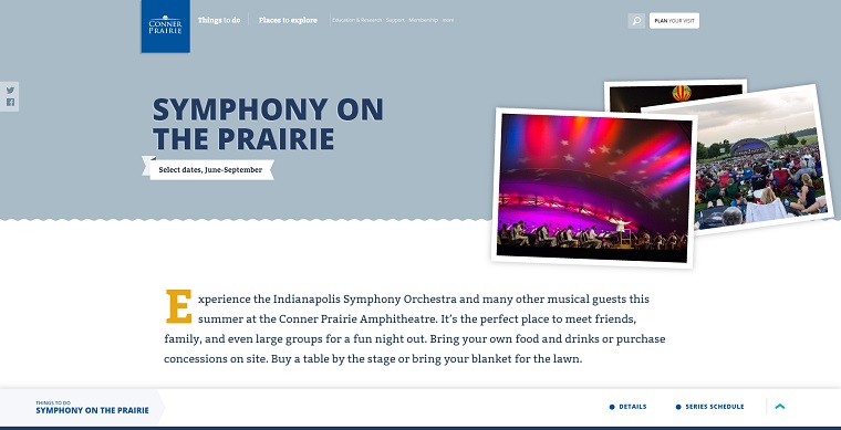
What I Like: I would be remiss if I didn’t throw a little love at the Indianapolis Symphony Orchestra. Conner Prairie’s Symphony on the Prairie plays itself as a big outside event to be enjoyed with family and friends. The themes and feelings they want to convey are translated very well to their website.
This is one of the few web designs I looked at that didn’t feel totally cramped and claustrophobic.The bright, soothing colors and large text makes it an extremely spacious design that is easy to navigate.
Visually, this website is striking. I already mentioned the strong color choices, but they also include amazing photographs and have a way for fans to add their own pictures using a hashtag. Finding a way to generate interaction raises awareness and builds a loyal fan base.
Each individual event has its own landing page full of useful information as well, each designed very well.
What I Don’t Like: Very much like White River State Park, this is not it’s own individual website and thus falls victim to a lot of substance. What you see, while pleasant to look at, is what you get. This also creates an awkward situation where they are forced to display the entire schedule on the main page and take up real estate that could have served a different purpose.
Lessons: Fan and visitor interaction is always fun and a great way to bring people back.
Winner, Winner?
We’ve now looked at 6 very different music venue web designs, each with their own successes and failures. However, when it comes to who did it best, my vote goes to Conner Prairie. Despite being a little hollow, the fabulous visuals, fan interaction and unique landing pages made this the strongest design for me.
Think I’m wrong or left someone out? Let me know.
I summarized some of the highlights of my reviews of venue websites in a short episode of More Than A Few Words. Listen now:
Want to use some of the successes, failures and lessons we discovered as a place to start with your web design or rebuild? Start with this quick audit and then let’s have a chat.


