
Don’t let the bottom be the last thing you talk about with your web designer. Your web design’s last row is called the footer. Why? Because feet are at the bottom of the body and heads are at the top (so we call the first row of a web design the head, or header). Like the header, your footer typically appears on every page of your site.
So, it’s an important spot to repeat important links and tie up your web design in a neat little package. When I feel like a design needs that extra “something,” I look to polish up the footer.
To help us get the footer right, I found a few examples of tragic web design mistakes to help us see what not to do. I reconstructed the footer designs with some standard elements to help us focus on what to change. Then I re-worked them to show you one way to deal with these terrible, awful tragedies.
The Inconceivably Incomplete Footer
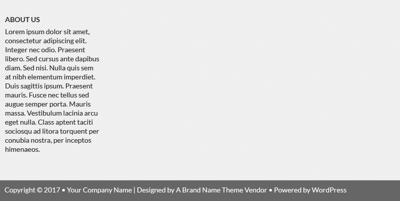
Many small business web designs use the WordPress content management system (CMS). This software is like the operating system for your website. It depends on add-ons called themes to craft the look and feel.
Unfortunately, some themes work like color-by-number designs that demand every box be filled in for it to look right. In the example above, we’re obviously missing some pieces. The theme probably expects three more columns of content and can’t be adjusted to show just one. And that looks really sad. Plus, there’s some critical pieces missing from this footer. Let’s tidy up.
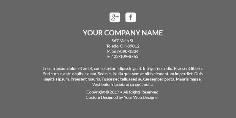
See! Same content, plus other essentials like contact information and social media links. If this was my client, I’d override the theme’s default styling code to redesign this simple footer as a single-column of centered text and social icons. With such a small number of items, I like to keep the design as simple as possible.
But what if you need to fit a little more in your footer?
The Busy, Crowded Footer
The footer is typically repeated at the bottom of every single page. Make sure you include a short paragraph about your company, contact information, a short menu of links if necessary and social media icons if you’re active on those accounts. Maybe link to your email newsletter signup page. But goodness, don’t stuff it all in a misaligned box like this one.
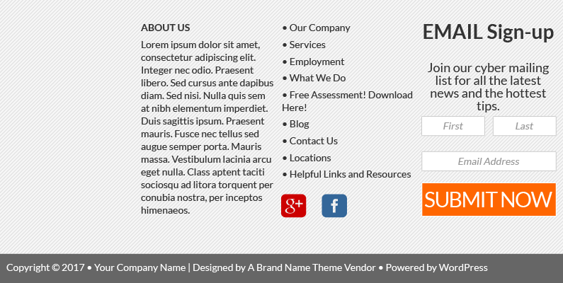
Looks like there’s a programming goof messing up the size and alignment of the boxes here. Plus there’s just way too much stuff! I said SHORT menu of helpful links, not the whole sitemap. And can we talk about the email signup form?
First tip: don’t stuff a signup form in your footer. So my reworked design will just omit that completely. Second tip: don’t say cyber anymore. Next, work on your signup button text. Use words that reduce the perceived commitment level, like Join or Send. SUBMIT sounds like someone forgot to change the filler text.
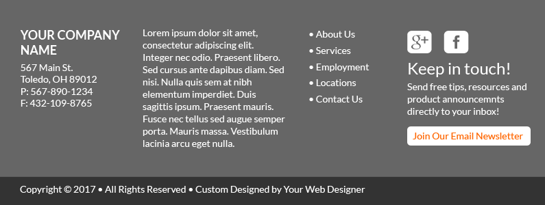
I’ve gone ahead and aligned things better while eliminating the cluttered feeling. When your website needs polishing, look to the footer. Like tying a nice bow on a gift, a complete and functional footer ties together even a lackluster design.
The Overgrown, Über-tall Footer
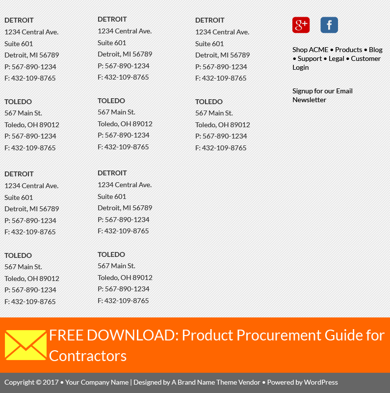
Why would you ever need to list full contact information for 10 separate locations? Please use a simple link to the Locations page instead. Make sure to add that important descriptive paragraph as well. And if you want to use your footer to build your email list, frame the call to action like it’s a natural extension of your social media and other online profiles. Use language that makes it seem more like following you on Facebook and less like sacrificing your first-born. Here’s my reworked version of this footer.

Notice how it’s the same as the last one? I’m not being lazy here, it’s just not that complicated. I think this draft covers all the same bases as the tragic original, but much more neatly and more polished.
What’s your website footer saying about you? Are you missing pieces? Disorganized and messy? Use your footer to neatly close the web design and add a little value with critical contact information and a limited selection of organized links.

