Some of us have an emotional relationship with coffee. Logically, the caffeine keeps us awake during an early morning or late night drive. But coffee is more than that. It’s the smell that reminds you of your grandma’s house every time she poured Folgers into the Mr. Coffee before serving dessert. It kept you company and your hands warm while studying for a midterm. It cooled over long conversations with dear friends.
Color Choice Matters
What would you do if someone served you a mug of clear coffee (or tea, or hot chocolate)? It tasted exactly the same, kept you warm and had the same caffeine content; the only difference is you can see the bottom of your mug. You’d think there’d been a mistake. That coffee is a lie. It’s not what your grandma made or your dad drinks or the coffee you’ve enjoyed for years. You’d send it back, a bit miffed and frustrated.
Logically, a product that tastes and smells the same at the same price point shouldn’t be an issue if it’s an odd color. Problem is, we’re emotional creatures. Presented with a product that doesn’t match our understanding of the world, doesn’t connect to previous memories and emotions, we don’t trust it. And we won’t buy it.
Oddly, Pepsi didn’t get the memo.
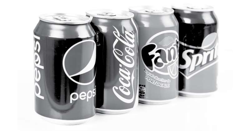
Fizzy sugar water comes in all kinds of colors, including translucent. In the early 90’s the traditionally “caramel”-colored beverage maker introduced a “clear” version. Excuse me, “crystal.” Something about it “just wasn’t right,” it didn’t match the original product’s taste, and it was off the market within two years.
That’s why your color choice is so important as you try to convey meaning and emotion at a glace. You’ve read articles saying red is typically seen as aggressive, blue is trustworthy, green is for growth, and if your company is international those connotations change. But do your color choices resonate with your target market’s understanding, really all their history and experiences previously fed to them through marketing campaigns? Or do your brand’s colors showcase a current, fresh take that will change with cultural norms? All too often color choices come down to personal preference, stripping them of their power to influence subconscious purchasing decisions.
If this sounds like marketing and design nonsense we sell to our clients, a study from Suave says otherwise. They went to the extent of developing an entirely fake line of skincare products, dressed them in modern, staid packaging with “millennial pink,” and the participants believed it worked better than the same product in different packaging.
If you’re like me you’re rolling your eyes at the idea of buying an everyday product solely for the colors and its packaging. I’ve trained myself to buy necessities based on actual functionality and price, down to the price per ounce. As a designer, I know I’m making subconscious decisions beyond price but, for my sanity I try to turn off some of my design experience during the weekly grocery run.
Although it’s what I do for a living, I was recently a victim of marketing by color and design. When it comes to body wash, I tend to stick with brands I know and buy based on what may be on sale or is just the better deal that week. Or frankly, what I’ve been using until I ran out and needed more. As someone who tends to see the world in pictures, I knew the bottle had a buttercream cap, white bottle and featured some kind of nut illustration in the middle. In the grocery store, I squinted down the aisle, found the bottle and tossed it in my cart. When I got home, it was an entirely different brand and probably the more expensive of the two.
I really should know better, and yet I spent my money based solely on color and design. The color choices sent all the right messages, that my purchase wouldn’t irritate my skin but also wasn’t the most expensive one on the shelf. How could I be sure of that? Based on all of the other times I’ve walked down a grocery aisle and bought similar products for the same reasons, and before that probably what my mom told me to get.
Pepsi thought it’d be super cool to have a clear version of their soft drink, and who knows, maybe it was a family member’s idea late one night. Similarly, your favorite colors may or may not be what is right for your product and what will resonate with your customer. Do a little testing; ask people from your target market how they feel about certain colors and whether they’d associate it with what you do. You may be surprised with the results and will benefit your brand in the long run.

