There is so. much. stuff. on the Internet. Everyone has an opinion about everything. Everyone has this great recipe you should try or the hottest takes on what that meme actually means. We’ve all heard the stats of how our attention spans are shrinking daily, and it’s no wonder. There’s just too much. So how do you get viewers to read your content? The blog post you spent time writing, editing and revising so it has the right tone and you haven’t missed any typos? Not only what you say is important, but also how you say it. And by how, I mean typography. Thanks to the democratization of design, basic typography terms and standards are becoming more well–known. For instance, the difference between serif and sans-serif type. For your beloved blog post and any other web-related content, we need to go a little deeper.
Not All Fonts Are Created Equal
Take a few sans-serif fonts, for instance. You’d think the shapes and how they’re drawn would be the most important aspects to consider when choosing a font. You’re not wrong, but the space a font creates is equally if not more important. For example, take the two lines below.
Both of those are sans-serif fonts, Oswald and Open Sans, respectively. They’re both set at 25 pixels and at a regular weight (as opposed to bold). You can even use this handy plugin to check for yourself; I use it all the time to see who’s using what typefaces. And yet, they’re very different. One’s a bit easier to read right off the bat. Why is that the case? (Pun not initially intended, but I’m not taking it out)
For one, Oswald is more of a “condensed” font. Notice how there’s the exact same amount of letters and spaces in both sentences, and yet the first line of Oswald is a lot shorter. The letters themselves take up less space, and there’s less space in between the letters. Oswald is also a heavier weight, or thicker. Compare the “x” for both fonts:

The blue Oswald “x” is so much taller and sturdier which is great for headlines and display typography. Open Sans stretches further, allowing for more balance, white space and breathing room which makes it an excellent choice for body copy.
Size Makes All the Difference
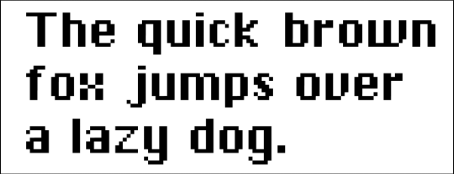
Microsoft Word has misled you. You open up a new document, start typing and it’s already set to an easy 12 points (pt.). Works just fine. I’ve always found this confusing since learning the ideal size for legible type is 11 pt. Just one notch down. So why did they set it at 12? The 11 pt. legible rule is for when you’re setting type for print. Words on the web are a different story because they’re made up of pixels. Initially this was an impediment and users only had a handful of fonts to choose from, all of which would now fall under the “robotic/digital” category.

As technology improved, there were more pixels to play with.

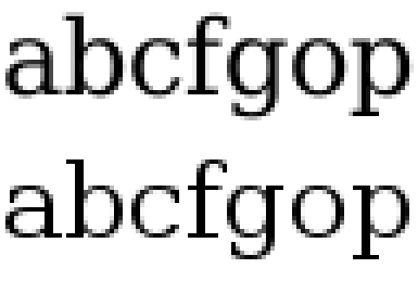
While letters on a screen are still made up of pixels, type designers can get pretty close to what they’re supposed to look like through hinting, or making sure all the pixels are exactly where they’re supposed to be and are the right color to get as close as possible to the original vision of the font.
Why does any of this matter? That was a long way to say that when you’re putting words on the Internet, they should be bigger for several reasons. One, as illustrated above, is that they’re a little fuzzier to begin with than their print counterparts. Two, when a viewer is reading something on a screen, it is most likely either on a desktop where they’re sitting a foot or two away, or on a mobile device which in and of itself is small. To make the reading experience easier, at least 16 pt. is standard for body copy. You might say “but I can read it at 14 pt.” which may be true if you choose a good body font, but test it for yourself. Set a page full of type in 14 pt. and 16 pt. and see which one is easier to read on a desktop or on your mobile device. And keep in mind, a viewer isn’t going to work as hard to read your copy as you are.
Choosing the right font and keeping it big are two of the most important rules of thumb when it comes to web type, though if you’re in the mood for an equally nerdy and more in-depth post about how to keep your type in shape, I wrote about it here. If you’re up for some practical homework, try applying these ideas to the type in your emails. The recipient might even read them.

