I’ve written before about how fascinating I think brand mascots are. It’s always amazing to me how little most of us know about the characters that represent some of our favorite brands. Some were based on a real person, others were created by ad executives and others are shrouded in mystery to this day.
Mr. Pringles:
I feel equipped to attend a trivia night now that I finally know the name of the mustached man on the Pringle’s can. He is Julius Pringles and he’s been rocking that mustache for 50 years. He’s been redesigned slightly, lost his eyebrows, gained a bowtie, but he had the same facial hair when mustaches were cool, when they weren’t and when they became cool again.
Sadly, Julius Pringles wasn’t a real guy. We know the potato chip shaped face was designed by Louis R. Dixon in 1967. The name is what people tend to disagree on. The name Pringles is usually associated with one of two plausible theories. The first theory claims the name comes from an inventor named Mark Pringle, who filed US Patent 2,286,644 titled “Method and Apparatus for Processing Potatoes.” Other people believe it’s no coincidence that two advertisers at Proctor and Gamble during this time lived on Pringle Drive in Ohio.
WWF Panda:
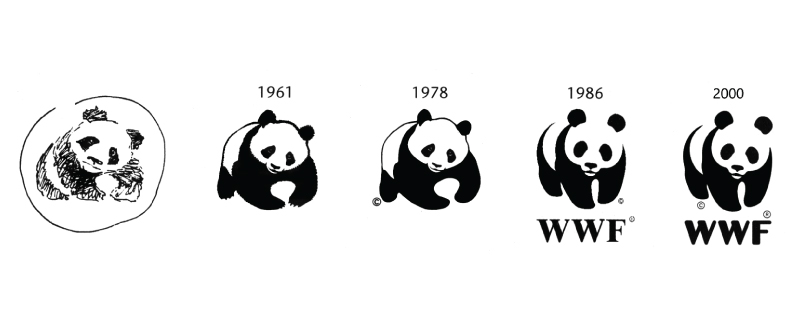
Sure, it isn’t a human face, but that doesn’t make people any less curious about the highly recognizable panda. This icon was designed to represent a particular giant panda named Chi Chi. She was the first panda in the world to receive international fame. The London Zoo was meant to have Chi Chi on a three week loan in 1958, but ended up keeping the gentle giant permanently. The Zoological Society of London made it clear they didn’t condone the collection of wild pandas, but since she was already in captivity they wanted to give her a proper home.
The World Wildlife Foundation set out to brand themselves in 1961, and they needed a symbol that would resonate with people worldwide and overcome language barriers. Chi Chi was chosen because of the panda’s endangered status, its strength, and the far less endearing reason; a black and white animal would save on printing cost.
Starbucks Siren:
Starbucks knew we would ask, so they have a page dedicated to telling the siren’s story. It’s not uncommon for a writer to be involved in the branding process, but we don’t always get to see this much evidence of it.
The story began in 1971 with the creation of Starbucks and the need for a symbol that could represent the company from beginning to end. Starbucks began in the seaport of Seattle, and the founders wanted to incorporate their nautical surroundings and the history of coffee traveling to the U.S. by sea.
In Greek mythology, sirens were infamously irresistible (albeit dangerous) creatures of the sea. I don’t think the creators of Starbucks could have fully fathomed at the time how accurate the comparison was going to be. Starbucks has many loyal fans, unable to resist the brand and the green Siren who is still the face of the brand today.
NBA Guy:
Similar to the MLB logo, everyone knows and agrees on who this logo is, but the NBA refuses to confirm it. Even Google is certain of it, and when you look up “NBA logo” a photo of All Star Jerry West pops up first. West played his entire 14 year career with the Lakers, and unsurprisingly picked up a few nicknames along the way. “The Clutch,” for his ability to come through in a crucial moment of a close game, and also “The Logo,” which is pretty self explanatory.
Global branding firm Siegal + Gale created the NBA branding in 1969 after spending hours poring over old editions of Sport magazine. The photo of Jerry West struck them because it was “dynamic, vertical and captured the essence of the game.”
The Morton Salt Girl:
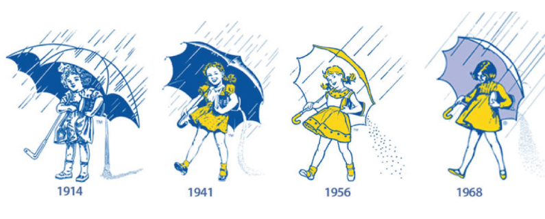
This little lady may be the oldest on this list, but she’s also the most beloved. People still don her yellow frock and lavender umbrella every Halloween, her image is printed on clothing and believe it or not, Morton Salt Girl tattoos are a real thing.
Since her creation in 1911 people have begged Morton to disclose the girl’s identity, but they insist she was never based on a real girl. There is a fascinating page on the website dedicated to her story and evolution over the years. She is unique enough to stand the test of time, and Morton has been wise enough to update and modernize her look as fashion has evolved.
Now you know the history behind the logo characters you probably never gave a second thought to. What these examples all have in common is a story. Any brand, whether literal or abstract, based on real-life or fiction, should have a message of some type. Many people have connected with these brands on some level, and part of that is likely due to the rich history and familiarity that resonates with people.


