When I’m not at The ‘Peg or out and about enjoying all the awesome things there are to do, see and eat in Indy, it’s a good bet that I am probably at home watching a movie.
A great movie can pull you in with a great script, astounding visuals and Oscar-worthy acting. But for me, it’s the little things that can really immerse you in the story being told on the screen. It’s all in the attention to detail.
If a filmmaker wants someone to really be captivated by the world they have created, they have to create fictional elements that seem so real you wouldn’t bat an eye at them. Like a fictional company in the film and the logo they stand behind.
A strong, convincing logo can resound strongly with the viewer – even if it is fake – and give it instant recognition. Admit it, there are some fictional logos that you would recognize just as quickly as Coke or Pepsi.
So who has done fake logo design the best and what is it that made them so great? More importantly, what can you learn from them in application to your own – very real – business?
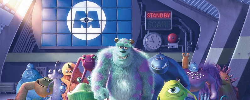
Monster’s Incorporated
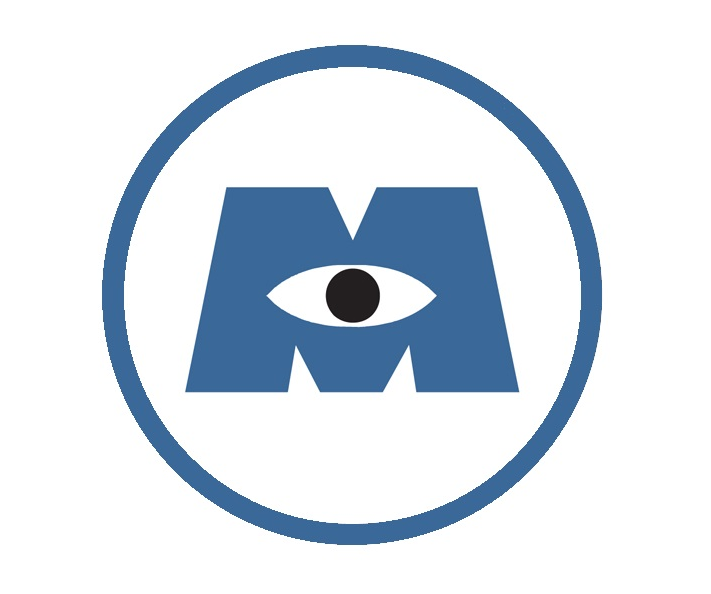
Yep, everyone’s favorite corporation of hideous/adorable monsters has one heck of a strong logo design. It really is straightforward enough, just a blue “M” with a CBS-esque eye in the middle. So why is it so good?
Apart from a slick design, the Monsters Inc. logo accomplishes a lot by doing very little. Sometimes the best logos are the simplest. They don’t bombard your senses with a bunch of junk, they just provide something that is visually appealing.
You may not know exactly what the company is or stands for just by looking at it, which is a valid counter-point. However, the power “M” gives the you the feeling of something big and when placed in the environment of the company works seamlessly.
Think about companies like Shell or Apple: you may not know exactly what they are based on the logo the first time you see it, but you really couldn’t picture another logo, could you?
What to learn from Monsters Inc.: Sometimes less is more.

Dapper Dan
I don’t want Fop! I’m a Dapper Dan man!
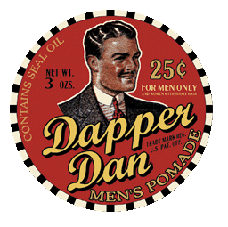
From The Odyssey-inspired, Depression-era set film “Oh Brother, Where Art Thou?”, Dapper Dan is the hair jelly that George Clooney has such an affinity for.
The designers of the logo did a terrific job replicating the look and feel of the stereotypical 1930’s advertising that we all know and love, which gives this fake product true authenticity. Although this look is certainly not the norm in today’s marketing world, this logo represents an ideal from that era that can be applied today.
In a business world of stiff competition, your product has to stand out. One way to do that is to project a message to your audience. In the case of Dapper Dan, the image of the “ideal man” may be enough for your audience to say “I want to be like that!”
Some companies today market themselves along similar lines. Take Coke’s “Happiness” campaign for instance. The idea essentially being Coke makes you happy so drink Coke.

What to learn from Dapper Dan: Use your logo to convey an idea or message.

Weyland-Yutani Corporation
You had to figure at least one evil corporation was going to be included on this list, right?
The shady corporation featured in the “Alien” movies maybe isn’t one a lot of people would immediately know or recognize, but that doesn’t mean the creators of the film shouldn’t get a nod for a really great design.
Big, bold block letters – like I briefly touched on in our first example – scream power and authority right off the bat and is very fitting to the target look and feel. You wouldn’t confuse this logo with one for a bookstore.
It also does a clever job of utilizing a complementary color scheme and blocks to create a captivating visual design with the “Y” behind the “W”. Not every single logo has to be straight forward. Our brains sometimes liked to be visually deceived and that opens up an opportunity to create a unique look (you can read more about the idea here).
What to learn from Weyland-Yutani: Be creative to create a unique look.

Ghostbusters
Go ahead, listen to the theme song while you read the rest of the blog… you know you want to!
You all knew it was going to be on the list, and if you disagree I would love to hear your argument against it.
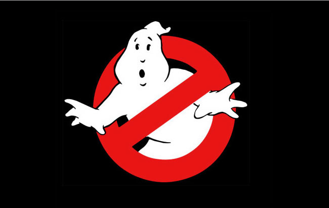
But in all seriousness: is there a more iconic logo in the history of film? The cartoon ghost. The big red circle with the cross through. It’s the perfect logo. You know exactly what the business does without having to read a single word.
That is the kind of logo every business owner strives for. One that conveys their message, mission statement, what they do without saying a single word.
Now, we all can’t be as awesome as The Ghostbusters, but as your business expands and your following grows, you can consider a logo redesign. By then, you may be able to achieve this. These kinds of companies exist outside of Hollywood, some day you could be among them.
What to learn from Ghostbusters: Find an image that says it all without saying anything.

Are there any logos I missed? Tell me what fake logos from movies and TV you like the most.
And if your current logo is a little tired or dated, Roundpeg has an incredible design team that wants to work with you to find a new and exciting look for your organization.
Roundpeg is an Indianapolis graphic design firm.

