
Why just 9 web designs? Because I can’t take it anymore. I’ve searched the Midwest and I’m done. The state of websites for Certified Public Accountants (CPA) is just woeful. Woeful! We can do better, friends. In the name of better web design, let’s take a journey through nine designs that caught my eye cruisin’ the local search results one day.
I searched nearby city names along with keywords like “CPA” and “accountant”. This little list isn’t a ranking, but really a survey. I found a few commonalities, so I’ve organized my findings by theme.
Basics Done Right
CPA websites have a few basics you absolutely, totally, every-time have to get right. Things like consistent application of branding, clear and easy navigation, polished visuals and photography and clear call-to-action buttons. These websites are on top of it.
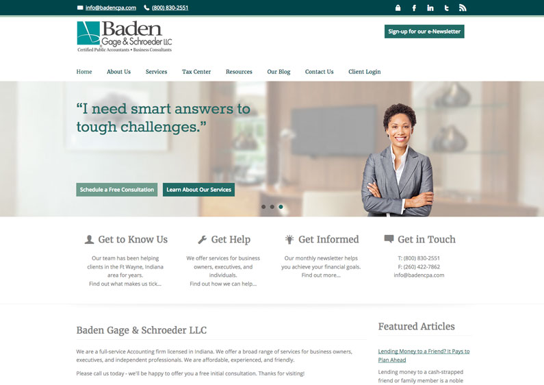
I literally wrote this section’s introductory paragraph while looking at the Baden Gage & Schroeder website. This solid site extends an already trustworthy-looking brand. Can’t say no to those nice shades of green which remind you of money. The navigation bar is super concise. They’ve grouped related content under drop downs, but helpfully made the top level link a directory of all the grouped pages. Gotta have that for mobile.
The visuals are, umm, cheesy. These are surely stock photo people on the homepage, kind of floating on those blurred backgrounds. It works, barely. Someone took the time to pick good backgrounds and sort of fake these people into the scene. Except for the soccer dad. He creeps me out a little.
Creepy stock photos aside, the testimonial-as-headline idea is really strong and keeps the focus on the customer and the how the customer benefits from working with the firm.
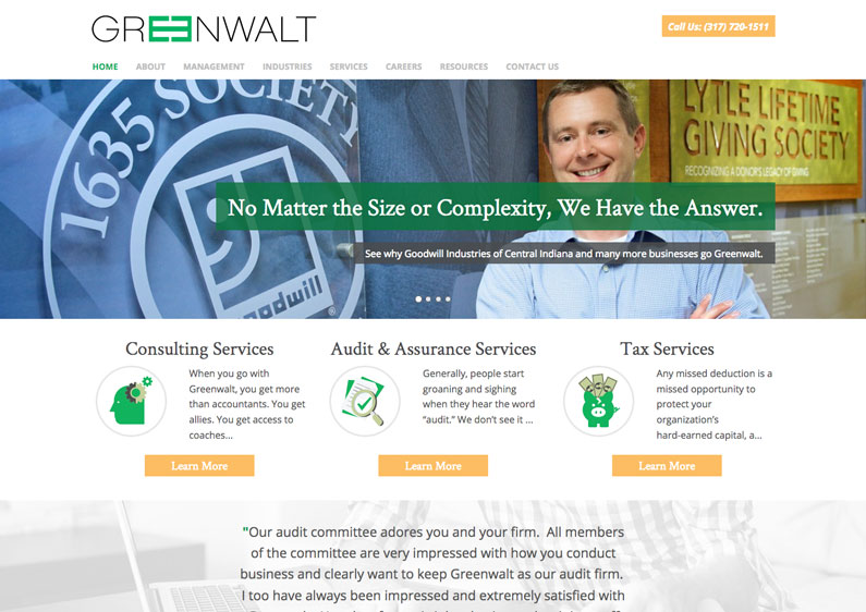
This site isn’t the most polished or well executed. I see a lot of things I’d tighten up or outright change. But I see strong homepage headlines. Straightforward navigation items. The three blurbs on the homepage spotlight their biggest service areas. A testimonial closes out the homepage with mention of specific reasons they like the firm. Whoo! Ten points to Gryffindor!
Something they should add to the homepage is an embedded video. They already have a customer testimonial video that’s quite nice in the About section. But it’s buried! Good video content is hard to come by. I can definitely see expanding the homepage with another section above the testimonial, but above the three blurbs that pairs the video with a 100-200 word paragraph introducing the video content and encouraging visitors to press play.
Clear Benefits
What I wish for every website is a clear presentation of their value proposition. What are the specific benefits of working with one firm over another? You can have all the basics covered and the freshest branding on the block. But I really want your website headline to tell me, quickly, why I should work with you.
helmscpa.com – web design by Roundpeg
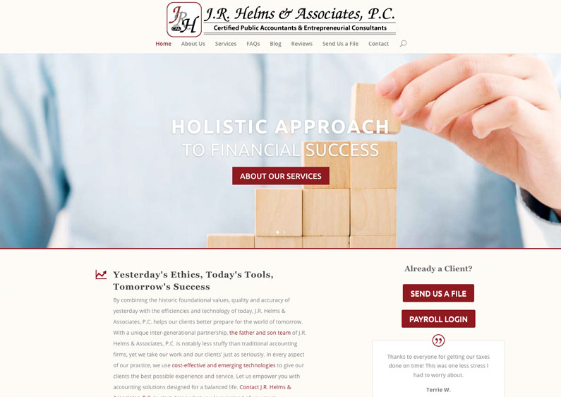
J.R. Helms & Associates does that. The headlines are bold and clear. HOLISTIC APPROACH. Got it. SMALL FIRM FOCUS. Got it. Totally dig it. I’m also attracted by the warmth in this site. The red and black branding could come off as really severe. But the addition of creme and a warm grey color create a welcoming, but still buttoned down, appeal.
Bonus points for polished presentation of the all-important “Send Us a File” button. Every CPA website seems to link to a client portal. Some are easier to use than others. This web design makes it clear up in the top navigation bar but it’s also prominent on the homepage.
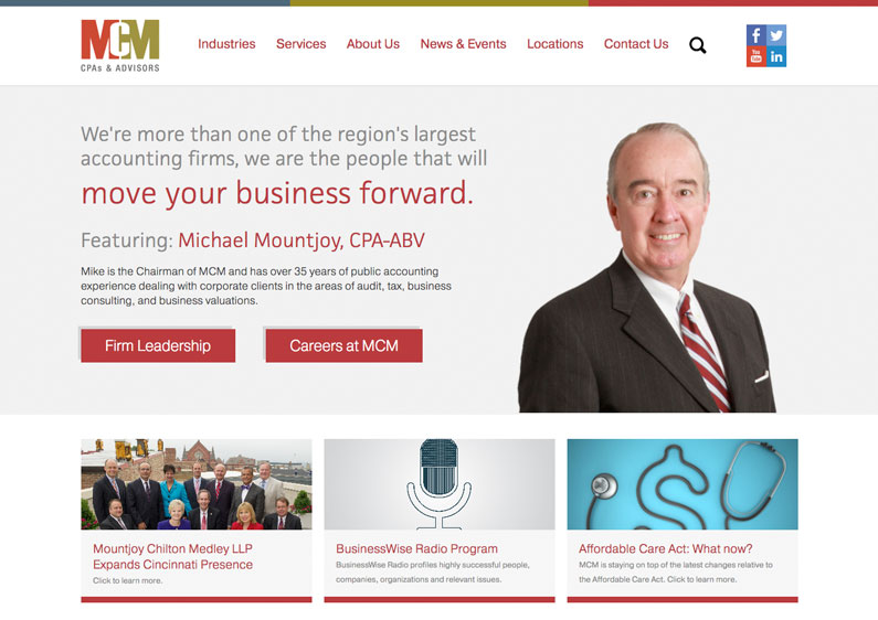
Mountjoy Chilton Medley (MCM) uses a slider on the homepage to display a rotating selection of headlines with pictures of their CPAs. The headlines are short and well written, with a word or phrase in each called out in a larger font and punchy red color. I like using the employee portraits because these pictures actually back up the claim made by the headline by connecting them to a real face.
You might remember how much I hate sliders. But MCM escapes my wrath by keeping the same button selection on every slider. There are different headlines, the same two buttons which makes the transitions less jarring.
Boring, but Polished
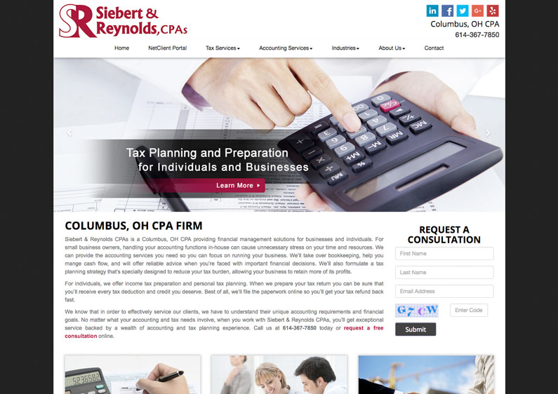
Yaa-aawn. Siebert & Reynolds is rockin’ that calculator stock photo like a pocket protector. They could do so much better. Scroll down and peep Corrigan Krause to see how it’s done. BUT! I’m impressed by the commitment to craft going on here.
This branding and this design is boring as heck but somebody took the time to custom-craft each element. There’s no rough edges. It could be more refined, more modern, sure. But each page has a healthy amount of text content. Icons and general styling are pleasing and easy to use.
This site is like the Corolla of websites. The polish and solid construction make it stand out from its local competitors. But other guys are doing it fresher.
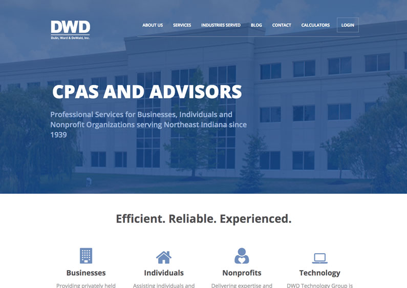
Of all the sites we’ve looked at so far, this one reaches the highest for a slick, modern design. Unfortunately, other parts of the visual presentation drag it down. While I love the blue overlay on the photo background, it’s a photo of their totally bland office building. The only value this photo brings is its impressive size. It makes DWD look fairly big.
But the number of CPAs at your firm or the square feet of your office is probably the least interesting thing you can start with.
You know what I do give them credit for? Consistent blogging. The published dates on their recent posts show a steady schedule of two or three per week. Big ups for keeping it fresh on your blog DWD.
Surprisingly Fresh
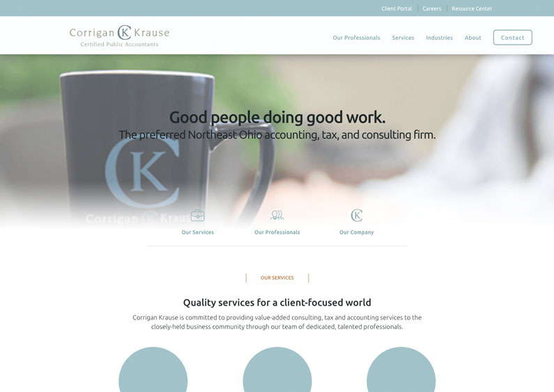
You can tell Corrigan Krause was fully invested in making this web design work. As far as I can tell, there are zero stock photos.
That’s refreshing. It looks like employees posed for a few staged images and a professional photographer did new head shots as well as general “around the office” pictures. Good job guys. A lot of clients I work with won’t commit to this. But this site proves it’s worth it.
Meanwhile, the design is clean, crisp and polished.

So, this web design isn’t for one single CPA. It’s a CPA business association in Ohio. As I was searching around, I found that every state seems to have one. But Ohio is the only one with a fresh-looking brand. It’s vibrant, but not too youthful. Anchored and serious, but not dour.
The Ohio Society of CPAs web design surprised me because I’d seen sites for five similar organizations. Each one disappointed me. Compared to OSCPA, they’ve got some catching up to do.
Especially since many seem to focus on learning and advancement. People are going online to research learning opportunities. Don’t think your old-looking site isn’t turning off people looking for leading edge learning.
By the looks, this is a recent rebranding. Glad they took advantage of the opportunity to refresh their website.
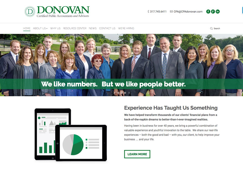
I just have to say something: These guys are adorable. Their leadership’s personalities and company culture are successfully worked into this site while maintaining a crisp sense of professionalism.
Possibly the best thing they have going for them are their smiling faces. I found a picture of their building on Facebook (where that kind of picture is actually kind of relevant) but this site’s visuals are a mix of custom-made icons and original pictures from one or two different photo shoots with their team. A friendly, candid tone informs the text content.
That literally makes all the difference. That’s what make this fresh, especially compared to the glut of primarily stiff, brochure-like CPA sites I found. Super-extra bonus points for adopting HTTPS.
Why Your Web Design Turned Me Off
Wondering why your CPA website didn’t make this list? Don’t feel too bad. My little survey of the CPA site landscape was highly unscientific. But I did some reflecting and composed a list of all the red flags that caused me to pass over a site.
Obvious stock photo
If you’ve gone ahead and purchased that stock photo of a firm handshake, I’m sorry. Hackneyed stock images are a one-way ticket to lamesville. Other stock photo offenses: using pictures of your city’s skyline over and over, literally spelling out the word QUALITY in 6 in. tall golden letters.
Putting a little photo of the Statue of Liberty in the corner
Unbridled patriotism might seem like a quick way to earn fans. Ooh, a little stars and stripes here! And let’s start every paragraph with a tiny picture of The Constitution wrapped in the flag! But it’s really a cheap way out of proving your worth as an actual professional in your field. Everyone’s a patriot. Show me what you can really do.
Cookie-cutter SEO treatment
Another big turn off is keyword stuffing. That’s the sin of loading down the homepage with a thousand words or more of content and ruthlessly repeating the same set of words over and over again. Here at Indianapolis’ best WordPress web design company, we’re your one-stop shop for web design, WordPress design, WordPress web design and more. See how annoying that is? Worse, keyword stuffing doesn’t work. So don’t.
Small-screen design
The worst and most common offense encountered on this strange trip are the numerous website’s designed for 90s-sized screens and never updated since. Most of these look made from early website templates built into decades-old publishing tools. They’re constrained to a small square shape that hugs the upper left corner of the screen, looking strangely pitiful on the widescreen displays common in most offices.
If your site is still optimized for 1999, I’m so, so sorry. You’ve gotten new business cards since then I’m sure. So why does your website have to suffer? Request a website tune-up from Roundpeg. We’ll take a look, analyze your issues and propose solutions customized for you.
Roundpeg is an Indianapolis web design firm.

