As you browse through old photos do you laugh at the fashion? Wide ties, leisure suites and hammer style parachute pants, what were they thinking?
What about your website? When you look back at old versions on Internet Archive what are the things you still like or dislike? What about things you’re embarrassed about, or looking back thinking “Why did we ever put that on our site?”
In 2008, we had a walking talking Lorraine on our homepage, that was the trend back then. You remember your MySpace page from 2005 when your favorite song just started playing as soon as the page loaded? Talk about a handful when you’re trying to spy on your friend while at work or in class. The autoplay of music, videos and audio files is definitely one trend we were happy to see go away.
Every year there are a few new web design trends. Some fade away quickly, while others hang around and stand the test of time. As trends shift faster and faster, your website needs to be flexible, so you can make small adjustments over time to keep your website fresh. Sometimes the best way to decide what to do with your website is to look at what trends have stood the test of time.
In early 2014, we wrote this post on up and coming trends. From long pages and larger images to simple calls to action, the trends we identified back then are all still relevant.
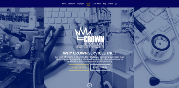
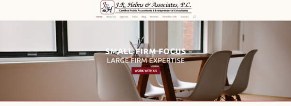
One great image defines your website
Since this trend emerged in 2014, it has been refined as designers play with both standard and parallax scrolling over the featured image and the size of the image. The cover images have grown as many sites now allow it to fill the entire welcome screen.
 .
.
Simplify Your Calls to Action
The shift to simple began in 2014. Today, clutter is a thing of the past, websites with multiple calls to action fighting for attention are not up to date. In 2016, web designers are utilize the space well by placing a strong call to action on top of an attractive cover image. This can be in the form of a button, a small form or simply an arrow directing visitors down the page, something that directs your audience what to do next. Deciding what your primary call to action will be is difficult, like picking a favorite child. It is critical because, when done properly, it is the first step in the journey to convert a visitor to a customer.

For more examples of these two trends in action take a look from our Web Design Portfolio page. And if you want a few suggestions on how to update your web sites style, sign up for a FREE Web Tuneup.
Roundpeg is an Indianapolis web design firm.

