Unresponsive: Web Design Options for Mobile

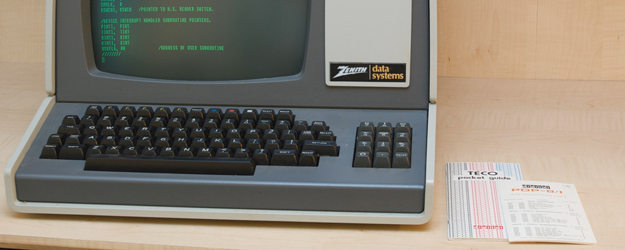
We’ve come a long way from dumb terminals, punch cards and flickering green computer screens. Smart phones are the new home computer and office work station in one. With faster wireless networks, these small screens allow us to experience rich media and do nearly everything the same as we might on our desktop.
Ever noticed how a favorite website displays differently on your phone? The smaller screen size of mobile devices presents a big problem for website owners who want to optimize their online appearance. Large images and rigid structures do not translate well to small devices with limited processors. This means older websites look awful when you load them at 100% on your phone. They can appear so tiny it’s like trying to find a needle in a haystack while you’re looking down from space.
A poor experience like that is a sure turn-off for customers. There’s no way you can allow your web visitors to keep seeing your big desktop homepage squished into a tiny phone screen.
To solve this problem, some websites opt for a mobile-only homepage, others rig up the facade of a “mobile app,” and the smart ones choose responsive design. Each option represents a different mobile marketing strategy. Here’s a quick breakdown of each.
Responsive Web Design
It’s better than all the rest, no question. The goodness comes from taking a mobile-first approach to the layout. Since most mobile screens are tall rectangles, responsive designs rearrange themselves into one-column layouts made to scroll up-down and not left-right. On desktops, the web design can respond by fitting the same content into wider layouts.
Your current web design was probably made to display only in a wide, multi-column style, which means it sucks to look at on phones and you need to fix it. But desktop-first sites can’t simply be retrofitted with a responsive style. To do it right requires a fresh start, a thoughtful and complete mobile strategy and a new web design.
Learn more from Roundpeg’s recent blog posts on responsive web design.
What if you recognize the need for a mobile strategy, but don’t have the resources for a redesign right now?
The “Mobile App”
The world is obsessed with apps. We’re familiar with their large buttons and simplified menus. In some cases, you might be able enhance a visitor’s mobile experience with website plugins that direct visitors to mobile-only content designed for smaller screens. This isn’t responsive web design, but it could hold you over for a short time. Depending on your current website and hosting arrangements, creating a small, app-like site can be less expensive than a full redesign.
Try this WordPress plugin: WPTouch
Mobile Only Landing Page
If resources are really thin, you might create a laser-focused strategy with a mobile only landing page. Like with the “app” mini-site, special code will detect mobile visitors and send them to one page optimized to display on mobile devices. This page should prominently display your phone number, address information and a few details about your business. Make sure there’s a link to your main homepage as well.
Combine these WordPress plugins to try this tactic: Create landing pages with Premise and use WP Mobile Redirect to funnel visitors to your mobile optimized landing page.
Each option requires some graphic design and website development experience to truly create a polished mobile experience. The option you choose will depend on your mobile marketing strategy and the availability of human and cash resources. I recommend making plans now to sit down and soul-search a little to find the right solution to your mobile problem.
