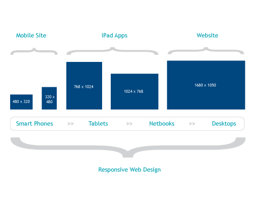
It used to be easy to design a website to display correctly on any computer monitor because they were all the same size. But today’s desktop monitors vary from small 800 x 600 pixel displays to some as large as large as 1680 x 1020. Further complicating the web design process are the growing number of tablets, smart phones, notebooks, netbooks and other devices on which your customers and prospects can view your site. Oh, and don’t forget the growing trend of surfing the web on smart TVs and through video game consoles.
A few years ago, these new devices represented just a small segment of the market, hardly worth worrying about. Not so any more. Tablet sales are expected to exceed 100 million units this year and many analysts predict they may outpace notebooks in the next year. With more US mobile subscribers then ever shifting to smartphones, mobile is likely to be the primary point of access for most websites. As the types of devices have expanded, so have visitor expectations. They assume they will be able to view your website however they choose to access it–and they should be able to.

2013:The Year of the Responsive Website
What can you do to be sure your website looks the way it’s supposed to? One technique is to upgrade to a responsive web design. In simple terms, responsive websites respond to the device that accesses it and delivers the appropriate output. The site will adjust to screens that are small or large, landscape or portrait, ensuring that visitors find what they came for.
If you are running your website on a WordPress theme that’s more than a year old, it probably isn’t completely responsive. We have designed websites using WordPress for a number of years because most of their themes look good on mobile devices, but that didn’t mean they were truly responsive. Fortunately, we’re seeing most theme design companies racing to improve their themes. Many of our favorite themes from Studio Press and Elegant Themes have been converted to responsive designs.
If your site was built on WordPress, the good news is that your existing content and graphics will flow easily into a newer responsive theme. If your site is more than a few years old, this is the perfect time to upgrade to a design that delivers content the way your customers want to read it.
Hardware will continue to improve and change, and as a result, the software you use to run your website will need to continue to grow and change with it. Not sure if your website is keeping up?
Download a free copy of our short eBook, Why People Hate Your Website, or give us a call and we will be happy to audit your existing site.
2016 Update: This post is almost four years old. Today we expect every website we visit to be mobile responsive technically many are. They adjust their display. The problem is that many people are just adjusting their display without thinking about who users want different things when they are on a mobile device. True mobile responsiveness is more that just adjusting your font, it involves adjusting your priorities as well. As an Indianapolils web design company Roundpeg considers both sides of the design equation.
