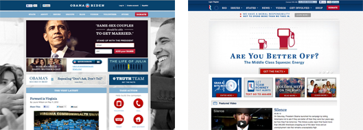
America’s general election campaign season is spinning into high gear. That means it’s time to judge the candidates on what really matters most … their website homepages.
Mitt Romney is reported to have hired “a lot” of web designers to help him battle President Obama’s seasoned digital campaign vets. Meanwhile, Obama’s Instagram account is publishing a steady stream of exciting, in-the-moment snapshots from campaign events around the country. For both candidates, the websites are hubs of their online activity, as well as the distillation of their messages into brisk calls to action. Check out screenshots below or visit barackobama.com and mittromney.com yourself.
Here’s the game: scores are awarded out of five points. Good moves earn points. If I’m displeased with something, points will be subtracted. Like the electoral college, I retain the right to declare a winner regardless of points scored.
The Featured Slider
Mitt uses a traditional slideshow-like display of images to show a variety of messages and information. Many contemporary websites have this feature, but few know how to use it well. Mitt’s team has the right idea by keeping the mood light and restricting the amount of information to a few key phrases paired with a pleasing visual. Three points to Romney for good use of the featured slider.
Oddly, there are few photos of the candidate here. Mitt’s lost in the crowd on his fourth slider, while the other three images are well-designed, but face-less graphics promoting upcoming events and promotions. I have to subtract two points for burying the smiling face on the fourth slide and slash one point for the milquetoast graphics.
Winning Converts Every Day
As always, Obama’s campaign offers a surprise. While Romney’s slider flits from image to image, Obama’s homepage features mostly static elements. Where a featured slider would go is a stern portrait of POTUS along with a call-to-action. Stand up with the President by adding your name (to his mailing list)! Studiopress offers a neat WordPress theme with a similar email-collection tool. For brands invested in email marketing, this is a new web design element that helps convert your website visitors to regular subscribers.
It’s worth noting that the composed, serious portrait in the featured area is countered by an over-sized black and white photograph sitting in the background. Obama smiles naturally, greeted by a throng of supporters. It reminds me of classic pictures of other political figures in LIFE magazine. Check out LIFE’s tumblr for cool, unpublished pictures.
So what’s Obama’s scorecard like? He earns two points for classic photography and two points for the innovative email collection tool. But I’ll subtract 2 points for a cluttered homepage layout below the primary call to action. There were simply too many options to peer at.
Final Score – Mitt: Zero, Obama: Two
Both candidates have attractive websites, with plenty of easy points of entry to their marketing messages. What can your business learn from this year’s campaigns? Do your homework this election season and add their websites to your reading list.
Need help? Contact Roundpeg, and Indianapolis web design firm.

