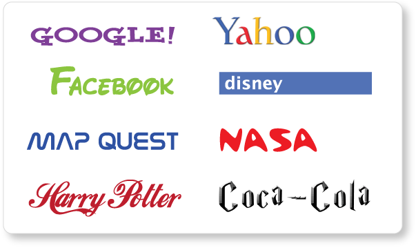
What happens when you make a font swap?
For most people, their first interaction with a brand is the logo. Without realizing it, the consumer passes judgement on the brand based solely on their initial reaction to the logo. The logo’s purpose is not only to hold the brand together aesthetically, but also to convey a certain message about the product or service. As a designer, it is my job to make sure the design sends the right message at first glance.
At the core of a logo design is the choice of font. Is this font easy to read? Is it the right style? What is it saying about the company? These questions and many more are part of the decision making process, which can be tedious and stressful, but extremely rewarding when done correctly.
Most of the fonts used by well-known brands can be recognized by the average consumer, even without seeing the actual company name or logo. These fonts are ingrained in our minds and I think it’s jarring to see them used with other brands.
 To prove my point, I decided to take a few of the more recognizable brand fonts and switch them around. The results were pretty amusing. In most cases, I was actually surprised by how differently I felt about the brands based on the “new” font choices.
Seeing the very modern and simplistic Google written in Yahoo’s purple slab serif seems silly. The font destroys its credibility. Yahoo! and Disney both lose some of their enthusiasm and playfulness. I imagine if I were to show these versions of the Facebook, MapQuest and NASA logos to people unfamiliar with their brands, they would never correctly guess what these companies do. The most entertaining of the logo switch ups is Harry Potter/Coca-Cola, because suddenly Harry Potter seems old-fashioned, and Coca-Cola is most likely an energy drink of some sort.
A successful logo matches the personality of the brand, sending the right message and most importantly creating an emotional connection with the consumer. As you can see, fonts play an important role in that process.
While I chose to use extremely recognizable fonts to prove a point, the same effect can be seen with any logo, even yours.
